-
👩🏽💻 Role
ResearchApp Design
-
📆 Duration
Jun 2023 - Jul 2023
-
⚙️ Tools
FigmaFigjam
-
🗂️ Type of Project
Academic

odisea.
05.07.2023
An e-commerce app for a bookstore.
Odisea is a specialised shop in comics, manga, and an array of fantasy and science fiction literature. It operates two stores in Barcelona and aims to expand its presence into the digital world through the launch of an e-commerce platform.
CONTEXT.
The Challenge
The primary goal was to enable users to access the entire catalogue online, while also facilitating purchasing and delivery to their doorstep. The provided data suggested that the target demographic consists of young adults aged 18-35 who exhibit a strong interest in reading and want to stay updated on the latest releases.
RESEARCH.
Interviews
- 📌 They value the drawing style, which is a decisive factor in their purchasing decisions.
- 📌 They need to maintain a record of the books they own to keep track of which ones they’re missing.
- 📌 They want to stay updated on the latest releases of their favourite books.
User Persona
Based on the findings from the interviews, I proceeded to create 4 distinct user personas. These personas were primarily divided into manga or comic readers and ranged from expert users to beginners.

Information Architecture
When designing the structure of the app, I planned all the essential sections and features. A key part of this plan was creating a section called “My Library”, where users can easily see all the books they own, making it simple to keep track of their collection. Additionally, I wanted to improve the user experience by adding a “Wishlist” feature. This lets users mark books they’re interested in, making it easier to remember and consider them for future purchases.

DESIGN.
User Flow
After finalising the Information Architecture, the next crucial step was to create User Flows for every possible interaction the user might encounter while navigating through the application. Through the creation of these user flows, I aimed to identify potential pain points and optimise the user journey.

Typography and Colours
The font used throughout the app is Inter as it transmits trust, professionalism, and easy readability.
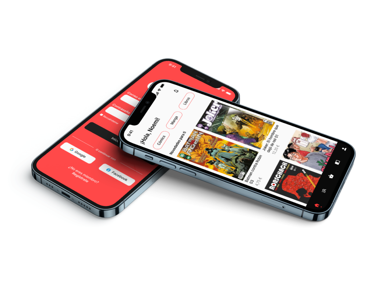
In terms of colour, I’ve implemented the corporate colours. Consequently, the primary hue is red, although a lighter tone to mitigate its association with danger. This ensures brand consistency while encouraging action in the CTAs, stimulating purchasing behaviour.

Wireframing
As usual, I started by creating wireframes of the structure I envisioned for Odisea. By adopting the content-first approach, I could clearly understand how the UI would take shape and refine specific elements that might have gone unnoticed using the Lorem Ipsum method.

RESULT.
Prototype
Finally, I designed a logo for Odisea inspired by the speech bubbles found in comic and manga books. With all the colours defined and using wireframes to guide me, I successfully arrived at the final design for Odisea.
Next Steps
Due to time constraints, I would have preferred to spend more time on the following aspects:
- 👥 Number of interviewees: While the Nielsen Norman study suggests that nearly 80% of usability issues can be uncovered with just 5 users, I believe it would have been beneficial to supplement these findings with a larger pool of interviewees.
- 🔨 App development: With only 1 week dedicated to UI design, I would have preferred to spend additional time to this phase. Expanding the number of screens designed for the app could have addressed a broader range of issues.
- 📱 Usability testing: Similarly, due to time limitations I was unable to conduct usability testing. Therefore, I would have liked to conduct a minimum of 5 usability tests to gather valuable feedback.
- 💎 Iteration: The plan is to iterate on both the design and functionality based on the feedback collected during the usability tests, aiming to continuously enhance the product.